
Karlo Group
2026

VS
2026
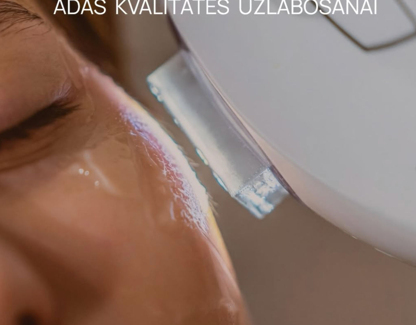
SKIN PROFILE
2026

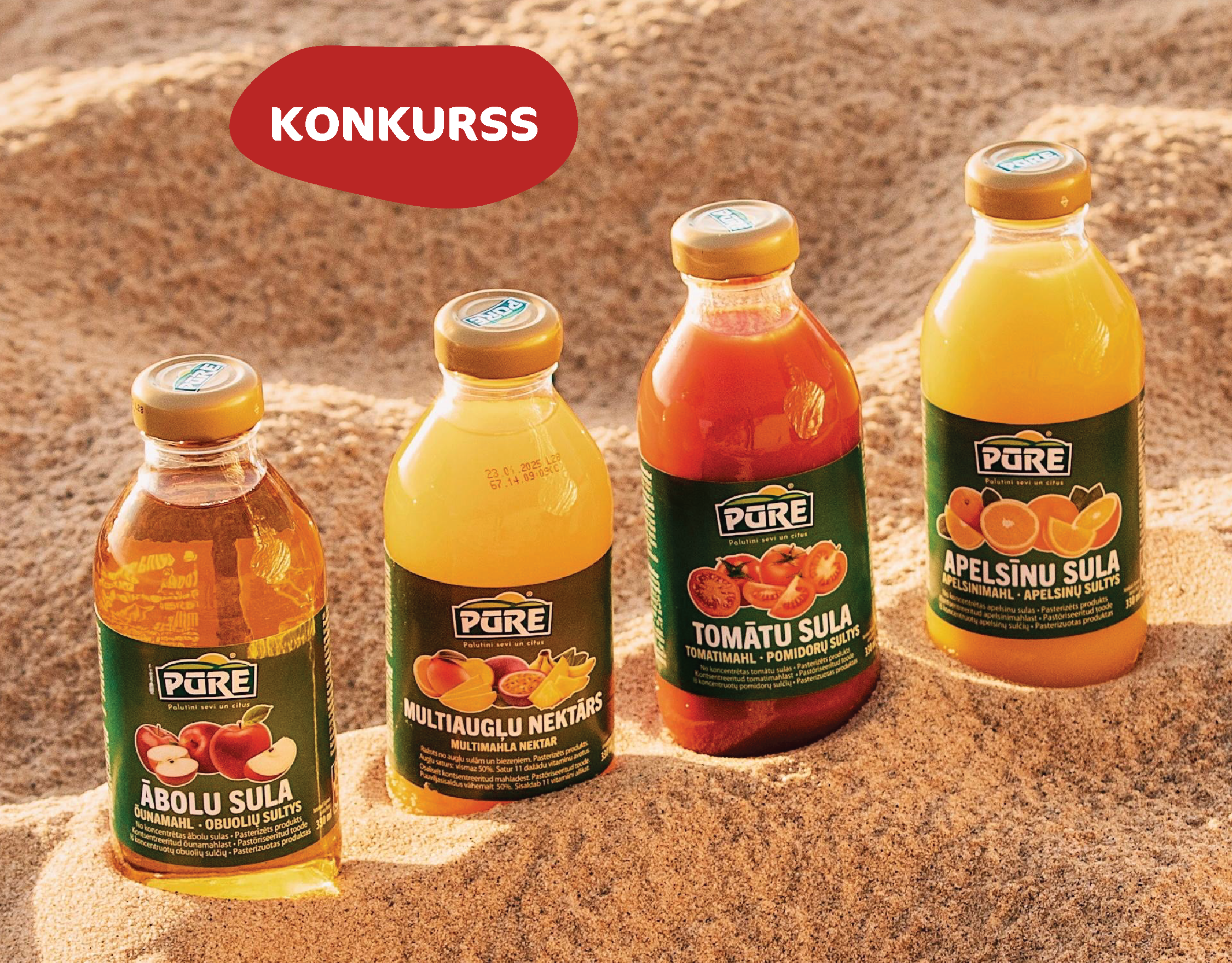
Rimi
2025
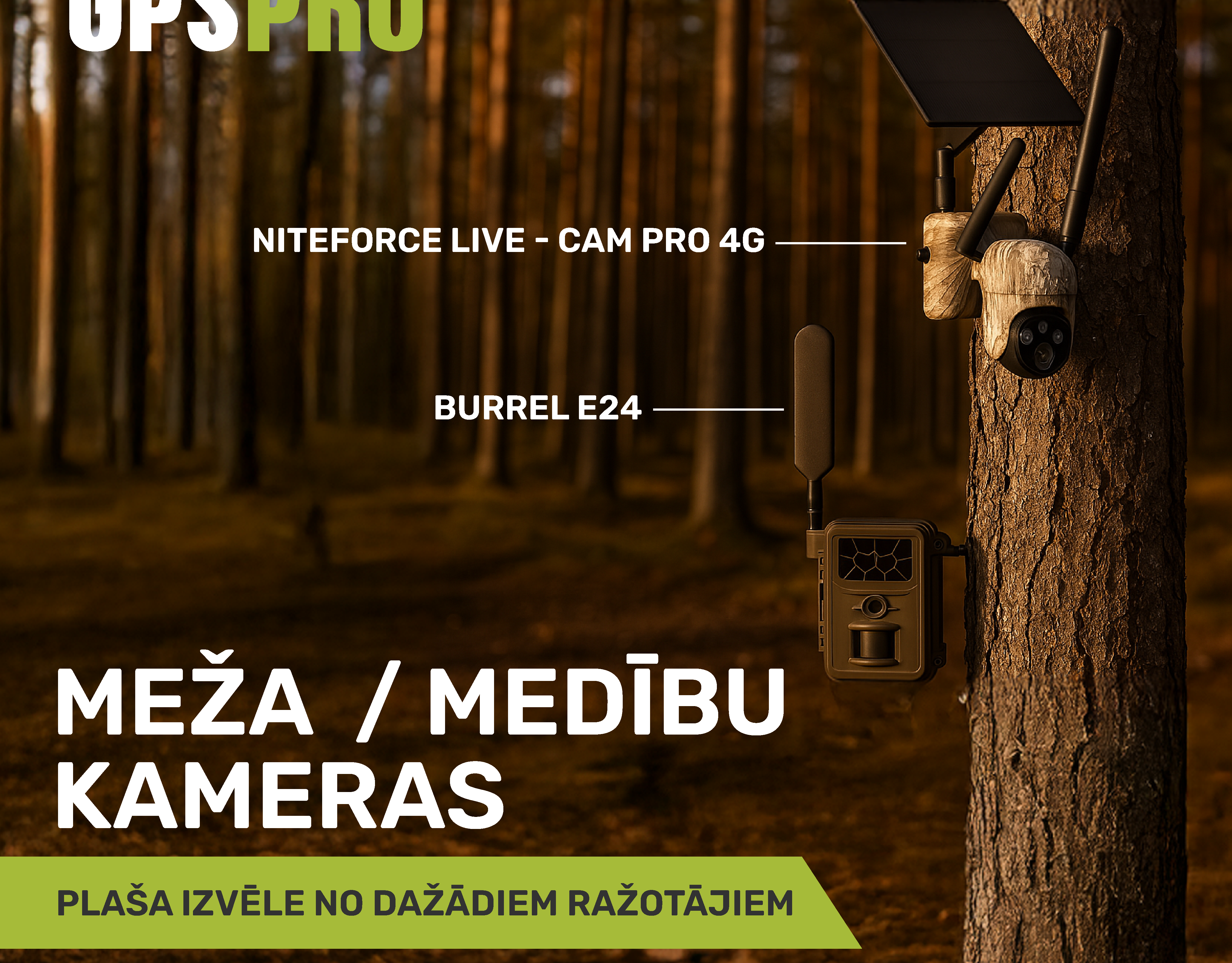
GPSPRO
2025
Collaboration with TEIKA STUDIO
2024
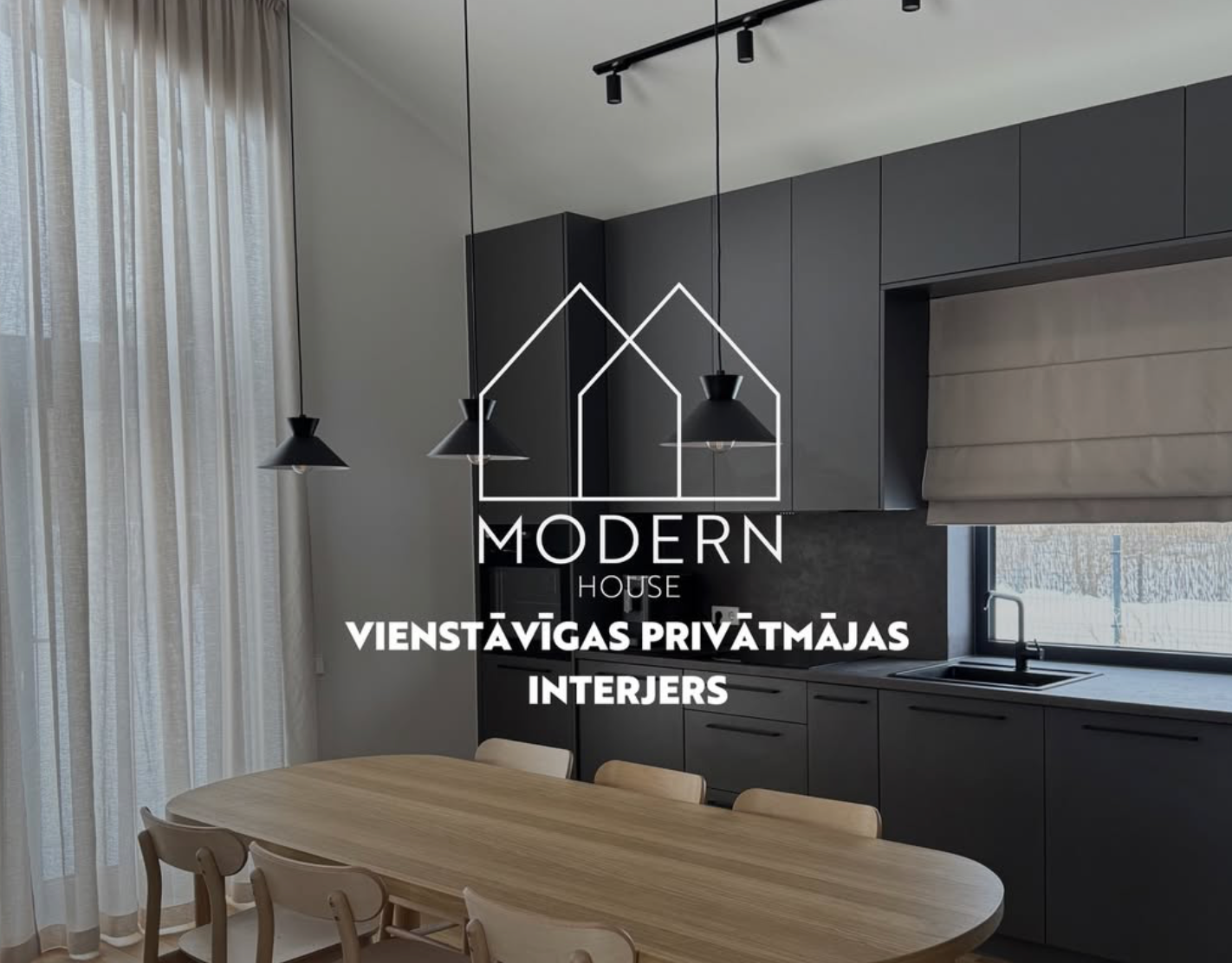
Modern House
2021