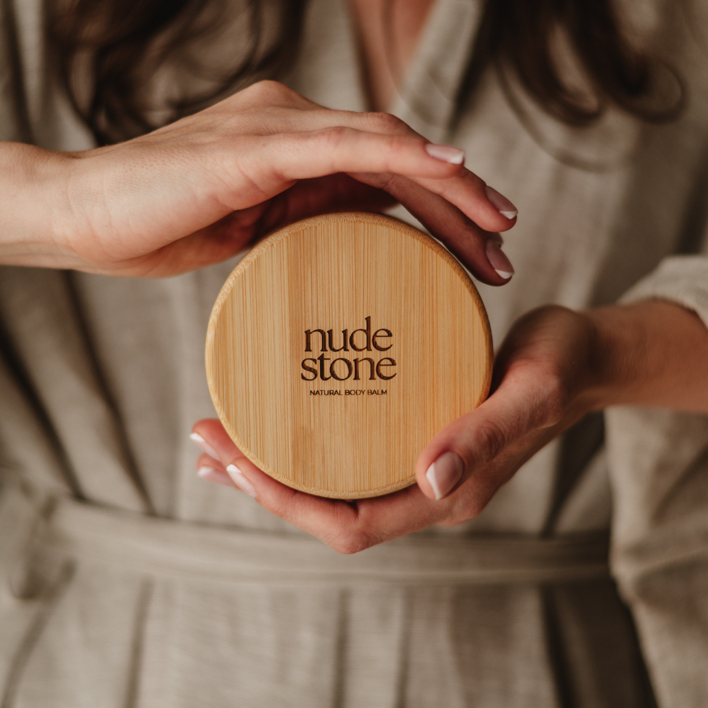
NUDE STONE
SKIN PROFILE
Baby René
MODERN HOUSE
KADORIA
Mii Studio
KUUP Dance
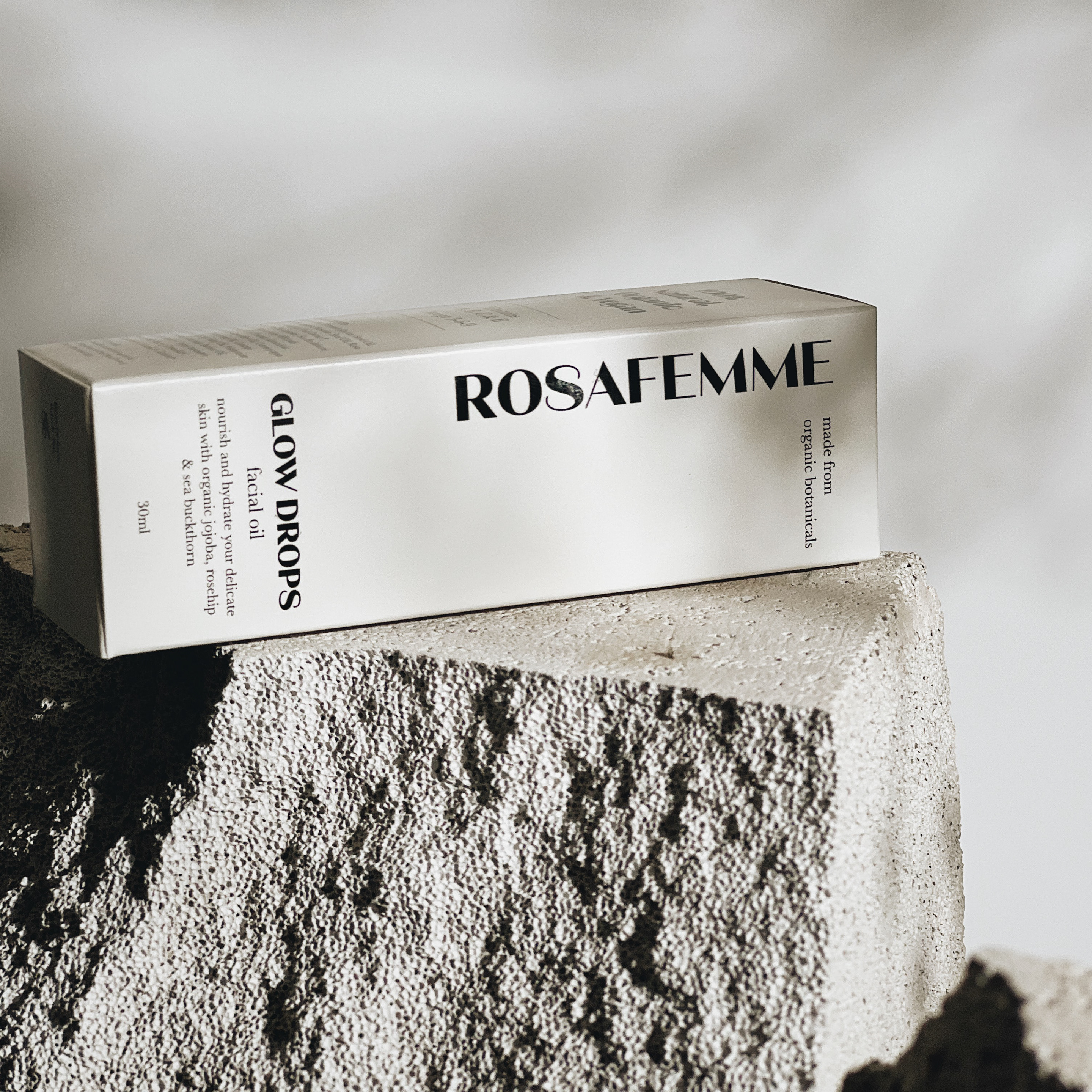
Rosafemme
FILIA
JZ Microphones
ESI
Modžo Padel
PIEJūRAS MEDICAL PRACTICE
AB BIO
Sigulda Zoo